The UI primitives
What architect ships to draw an app with: architect-ui's components and theme tokens, the shell's page parts, every kind of tab and pane in the workspace, the commands overlays, the settings page, and architect-story to browse them.
The previous chapter put an app in architect’s frame. This
one is the parts catalogue: every primitive architect ships for drawing an
app, what it is for, and a minimal rsx! for each, taken from real code
(the sandbox, apps/sandbox, the components’ own stories, and the crates’ docs).
Reach for these before writing your own; each already renders in Blitz.
There are two families, styled two ways:
| Family | Crates | Styled by | Use it for |
|---|---|---|---|
| The frame | architect-shell, architect-workspace, architect-commands, architect-settings | inline styles from ShellTheme | everything around and between your views: bars, sides, tabs, panes, menus, the palette, settings |
| The components | architect-ui | Tailwind classes over CSS-variable tokens (ThemeProvider) | what goes inside a view: buttons, fields, dialogs, tables |
The frame is inline-styled so it lays out the same in Blitz as in a browser
with no stylesheet; architect-ui assumes a stylesheet with its tokens. In a
Blitz window, check a component in the target renderer before you rely on
it, and read skills/architect/references/blitz-quirks.md first: it lists
what Blitz does differently (dropped spaces between spans, no ch, no
placeholder, no title tooltips, fonts from data: URIs never loading,
keys reaching only the focused node) and what to write instead.
architect-ui: the components#
architect-ui (features/ui/architect-ui) is shadcn-style components for
Dioxus 0.7, built on dioxus_primitives for behaviour and accessibility
and wrapped in architect’s styling. One use brings them in:
use architect_ui::prelude::*;

rsx! {
    Button { "Save" }
    Input { value, placeholder: "Name".to_string() }
}
What is there (features/ui/architect-ui/src/components):
| Kind | Components |
|---|---|
| Actions | Button, ButtonGroup, Toggle, ToggleGroup, Toolbar, Kbd |
| Fields | Input, InputGroup, InputOtp, Textarea, Checkbox, Switch, RadioGroup, Slider, Select, NativeSelect, Combobox, SearchableDropdown, DatePicker, Calendar, ColorPicker, Field, FormField, Form, Label, InlineEdit |
| Overlays | Dialog, AlertDialog, Drawer, Sheet, Popover, HoverCard, Tooltip, Dropdown, ContextMenu, Toast |
| Navigation | Tabs, NavTab, Navbar, NavigationMenu, Menubar, Breadcrumb, Pagination, Sidebar, CommandDialog |
| Content | Card, Alert, Badge, Avatar, Table, DataTableView, ListRow, KeyValueRow, Item, EmptyState, SectionHeader, StatusDot, StatusBadge, Accordion, Collapsible, Carousel, AspectRatio, ScrollArea, ResizablePanelGroup |
| Progress | Progress, ProgressBar, Spinner, Skeleton |
| Layout and type | VStack, HStack, Spacer, Divider (layout), Heading, Text (typography) |
The components’ file names are the reliable list; open the file for a component’s props. Three of them, from their stories:
// A switch bound to a signal (features/ui/architect-ui/src/components/switch.rs)
let on = use_signal(|| true);
rsx! { Switch { checked: on } Switch { checked: on, disabled: true } }
// Tabs (features/ui/architect-ui/src/components/tabs.rs)
rsx! {
    Tabs { default_value: "account".to_string(),
        TabList {
            TabTrigger { value: "account".to_string(), index: 0, "Account" }
            TabTrigger { value: "password".to_string(), index: 1, "Password" }
        }
        TabContent { value: "account".to_string(), index: 0, "Account details go here." }
        TabContent { value: "password".to_string(), index: 1, "Password update form." }
    }
}
// A dialog (features/ui/architect-ui/src/components/dialog.rs)
let mut open = use_signal(|| true);
rsx! {
    Dialog { open: open(), on_close: move |()| open.set(false),
        DialogHeader {
            DialogTitle { "Confirm action" }
            DialogDescription { "This cannot be undone." }
        }
        DialogFooter {
            Button { variant: ButtonVariant::Primary, on_click: move |_| open.set(false), "Confirm" }
        }
    }
}
Theme and tokens#
Colours and radius are CSS variables, named once in
features/ui/architect-ui/src/theme/tokens.rs (BACKGROUND, FOREGROUND,
PRIMARY, MUTED, ACCENT, DESTRUCTIVE, BORDER, RING, RADIUS, …)
and filled by the theme at run time (features/ui/architect-ui/src/theme/runtime.rs):
let theme_state = use_signal(default_theme_state);
rsx! {
    ThemeProvider { state: theme_state,
        ThemeSwitcher { state: theme_state }   // preset and light/dark
        App {}
    }
}
ThemeScope gives a region its own theme. Classes merge through
architect_ui::cn! (or cn::merge), so a class you pass overrides the
component’s own Tailwind classes cleanly. features/ui/AGENTS.md is the
component-writing rules (Dioxus 0.7 APIs only, owned Clone + PartialEq
props, primitives before hand-rolled behaviour).
The frame does not read these tokens: it takes a ShellTheme (its ink,
rule, accent, pill, font, …) on AppShell and WorkspaceView.
Read it in your own frame-level views with use_shell().theme.
The showcase#
features/ui/showcase is a desktop app that renders
architect_ui::showcase::Showcase, every component on one page, for
checking styling and theme behaviour:
cd features/ui/showcase
dx serve --platform desktop
The shell’s primitives#
architect-shell (features/shell, feature ui). The frame itself
(AppShell, form factors, the sides) is the previous chapter;
these are the parts a page uses.
Page, Toolbar, Breadcrumb#
A page states its bar; the shell draws it where the form factor puts it.
The simple form is a title, one main action and a ⋯ Menu:
Page {
    title: "Tasks",
    action: Action::new("New task", icon!(Plus), move |_| new_task()),
    menu: Menu::new()
        .item("Filter", icon!(Funnel), move |_| filter.open()).note("2 on")
        .divider()
        .check("Show done", show_done(), move |_| show_done.toggle()),
    TaskList {}
}
When a page has more to say, a Toolbar groups its buttons: separate
for a tool on its own, joined for tools in one pill; Tool::menu opens a
Menu, Tool::more is the ⋯. On a desk, crumbs is the breadcrumb before
the title. From the sandbox’s item page (apps/ui/src/pages.rs ItemPage):
Page {
    title: item.name.clone(),
    crumbs,                                   // Vec<Crumb>: Crumb::new("Tasks").on_press(…)
    on_back,                                  // a chevron before the title
    toolbar: Toolbar::new()
        .separate(Tool::menu("Move to", icon!(FolderInput), moves))
        .joined([Tool::action(done), Tool::more(menu)]),
    ItemBody {}
}
PageBar is the bar alone, for a page that lays out its own body.
Menu#
One builder for every ⋯, account and tool menu
(features/shell/src/shell/page.rs): item(label, icon, on_press),
check(label, on, on_press), .note("2 on"), .danger(), divider(),
heading(text). A menu row is 48pt on touch.
Status items#
architect_shell::use_status(vec![
    StatusItem::new("backlinks", "0 backlinks").left(),
    StatusItem::new("screenset", "Write").hint("⌘1 Write, ⌘2 Mix"),
]);
A bar along the foot (StatusStyle::Bar) or a corner badge
(StatusStyle::Badge), chosen on AppShell.
Drawers, the bottom bar, the switcher#
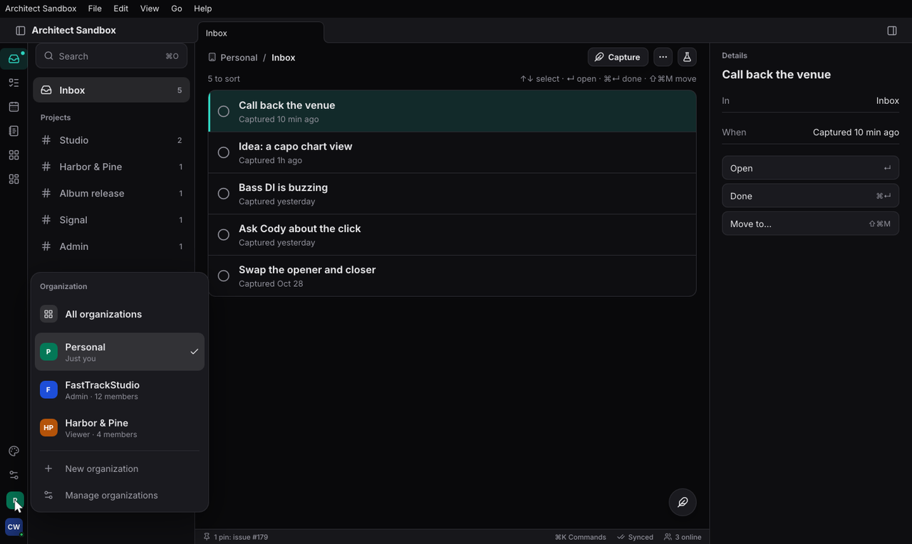
On a phone the sides are drawers: a swipe from anywhere opens one (a
stroke is classified after 12pt, and never taken from something marked
data-no-swipe), a swipe back or a tap on the dimmed page closes it.
Open one from code with use_shell().open(Some(Side::Left)). The tabs are
a floating pill (ShellStyle::FloatingPill), an iOS tab bar
(ShellStyle::TabBar) or a rail (ShellStyle::RailOnly); the
organization switcher is a Workspaces passed to AppShell (the
identity chapter builds it from the person’s orgs).
The workspace’s primitives: every kind of tab#
architect-workspace has one component, WorkspaceView, and a model whose
operations are every kind of arrangement (features/workspace/src/ops.rs).
The person makes them with gestures; your code makes the same ones on a
Workspace value, for a screenset or a command. Each below is what a person
does, then the call.
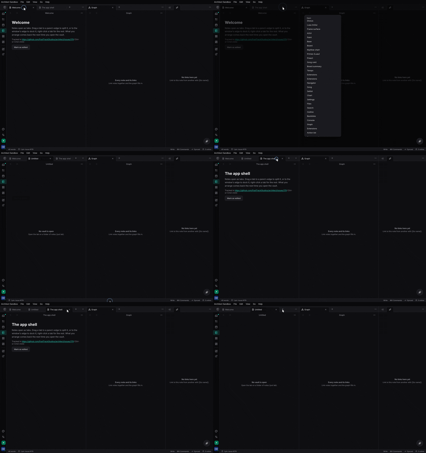
Tab groups. Each group has its own tab bar, a +, and a menu. Open a pane as a tab beside the active one:
let _ = w.open(Pane::new("note-1", "note", "Today"), Target::Tab);
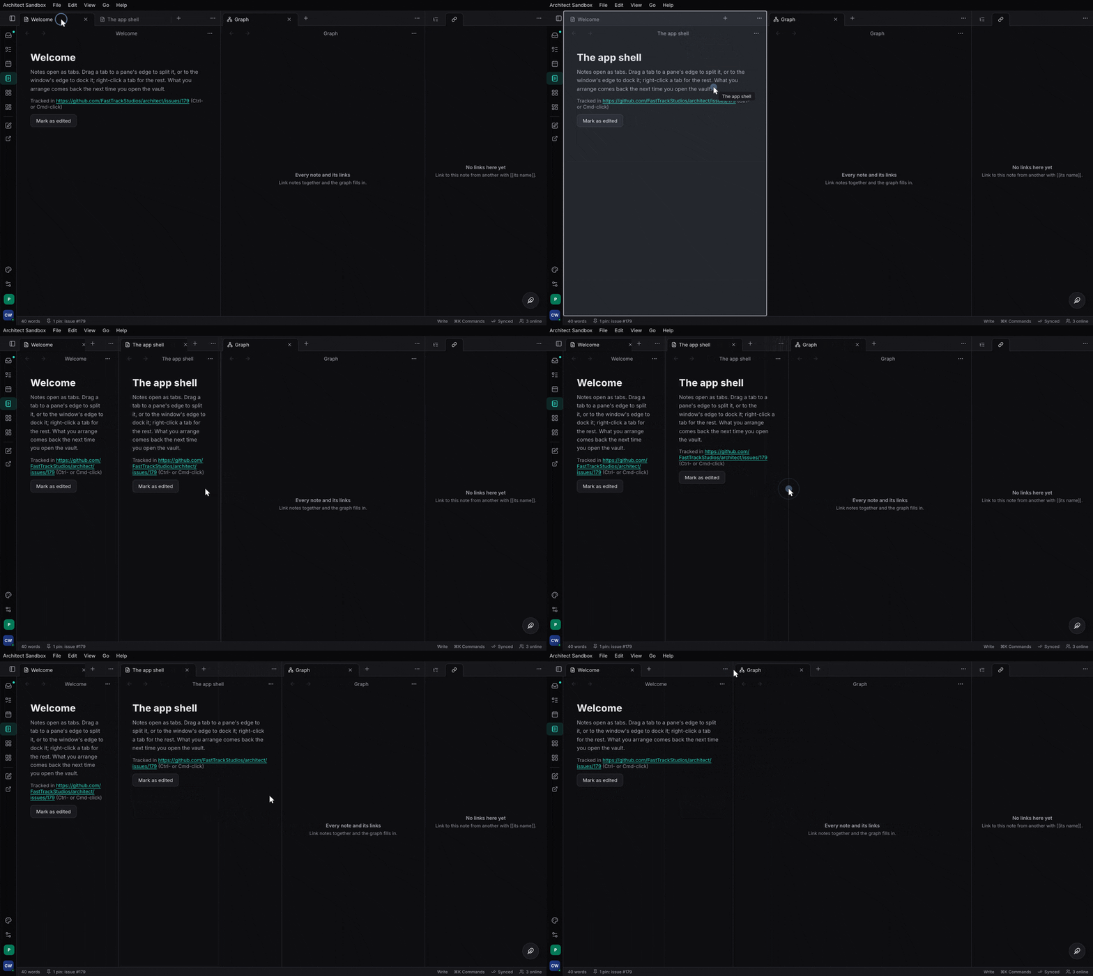
Splits. Drag a tab to a group’s edge, or Split right from its menu:
let _ = w.open(Pane::new("graph", "graph", "Graph"), Target::Split(Side::Right));
Dividers drag; a double click evens them (even).
Reorder and move. Drag a tab along its bar, or onto another group’s bar
or middle (move_pane(&pane, Dest::Group { group, index })).

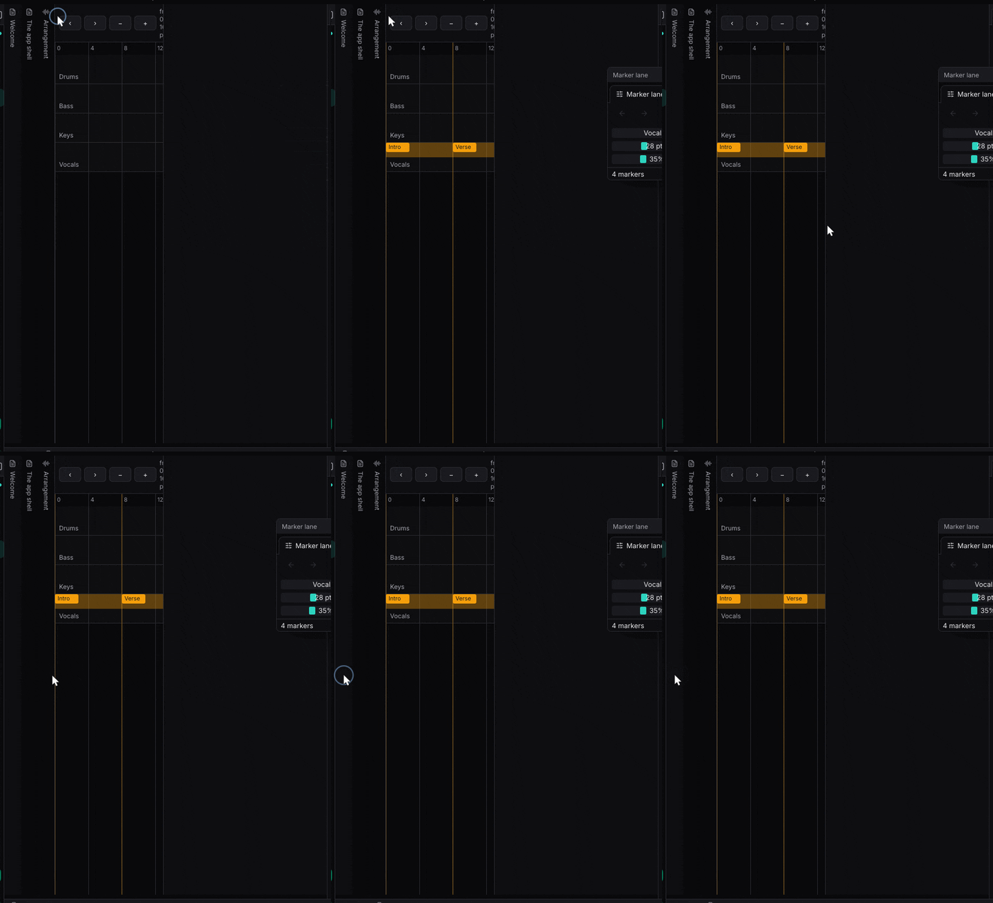
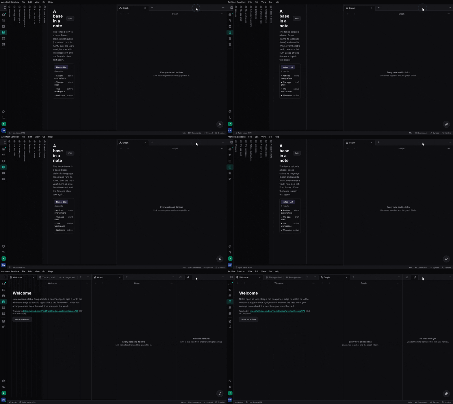
Stacked tabs. A group’s menu turns stacking on: its tabs become panes side by side in a strip that scrolls sideways, each sliding over the ones before it and leaving its spine (its title, written down the edge):
if let Some(g) = w.active_group() {
    let _ = w.set_stacked(g, true);
}
That is the sandbox’s “Mix” screenset (apps/ui/src/vault.rs mix_workspace).
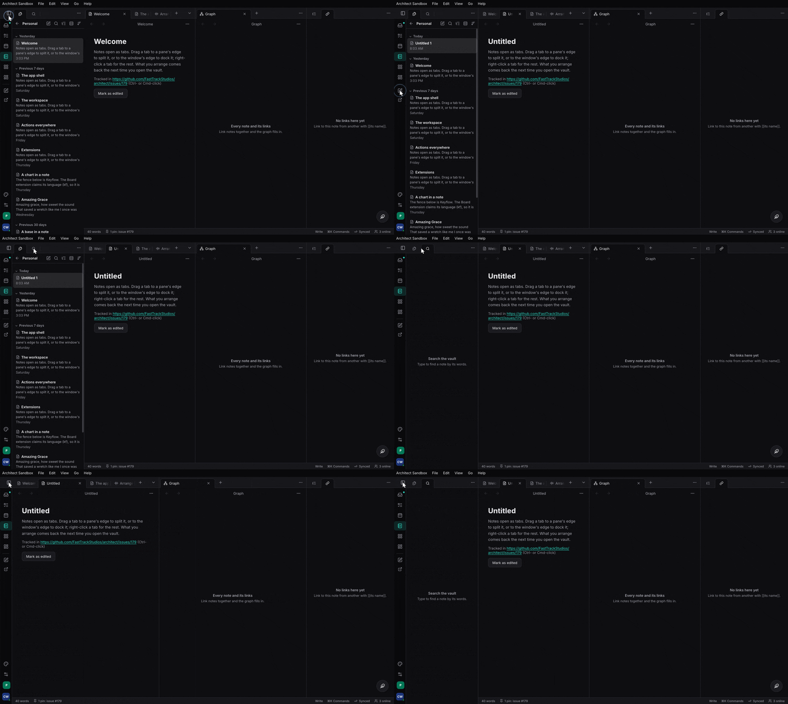
Docks and the ribbon. Left, right and bottom docks hold groups of their own behind a ribbon of view icons and pinned commands; each docks open, collapses to its icons, or hides:
let _ = w.open(Pane::new("files", "files", "Files"), Target::Dock(Side::Left));
let _ = w.set_dock_shown(Side::Bottom, Shown::Collapsed);
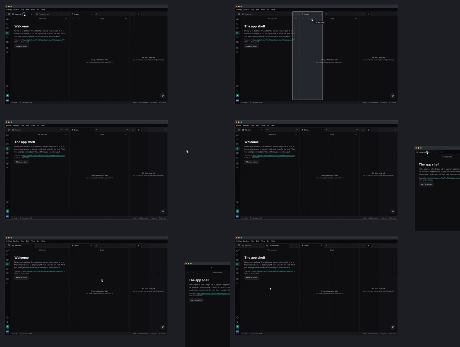
Floats. A pane floating over the window: drag by its title, snap to the top (maximised) or an edge (half, or a docked panel), minimise to a chip:
let _ = w.open(Pane::new("meter", "meter", "Meter"), Target::Float(Rect::new(520.0, 120.0, 260.0, 160.0)));
let _ = w.minimise(&PaneId::new("meter"));
Pop-out windows. A tab dragged out of the window, or “Move to new
window”, opens an OS window of its own on a desk (with the native
launcher); dragged back, or closed, its tabs return:
let _ = w.open(pane, Target::Window(None));
Pin, link, history. set_pinned keeps a tab from being reused;
set_link makes tabs follow each other; navigate, go are a tab’s own
back and forward. reopen brings back the last closed tab (⌘⇧T).
Arrange mode. Hold W: every pane shows its name and can be dragged, even one with no tab bar.
Screensets. A layout under a name, recalled by ⌘1–9, one layout per form class:
Screensets::default().with_builtins([
    Screenset::new("Write").slot(1).layout(FormClass::Desk, first_workspace()),
    Screenset::new("Mix").slot(2).layout(FormClass::Desk, mix_workspace()),
])
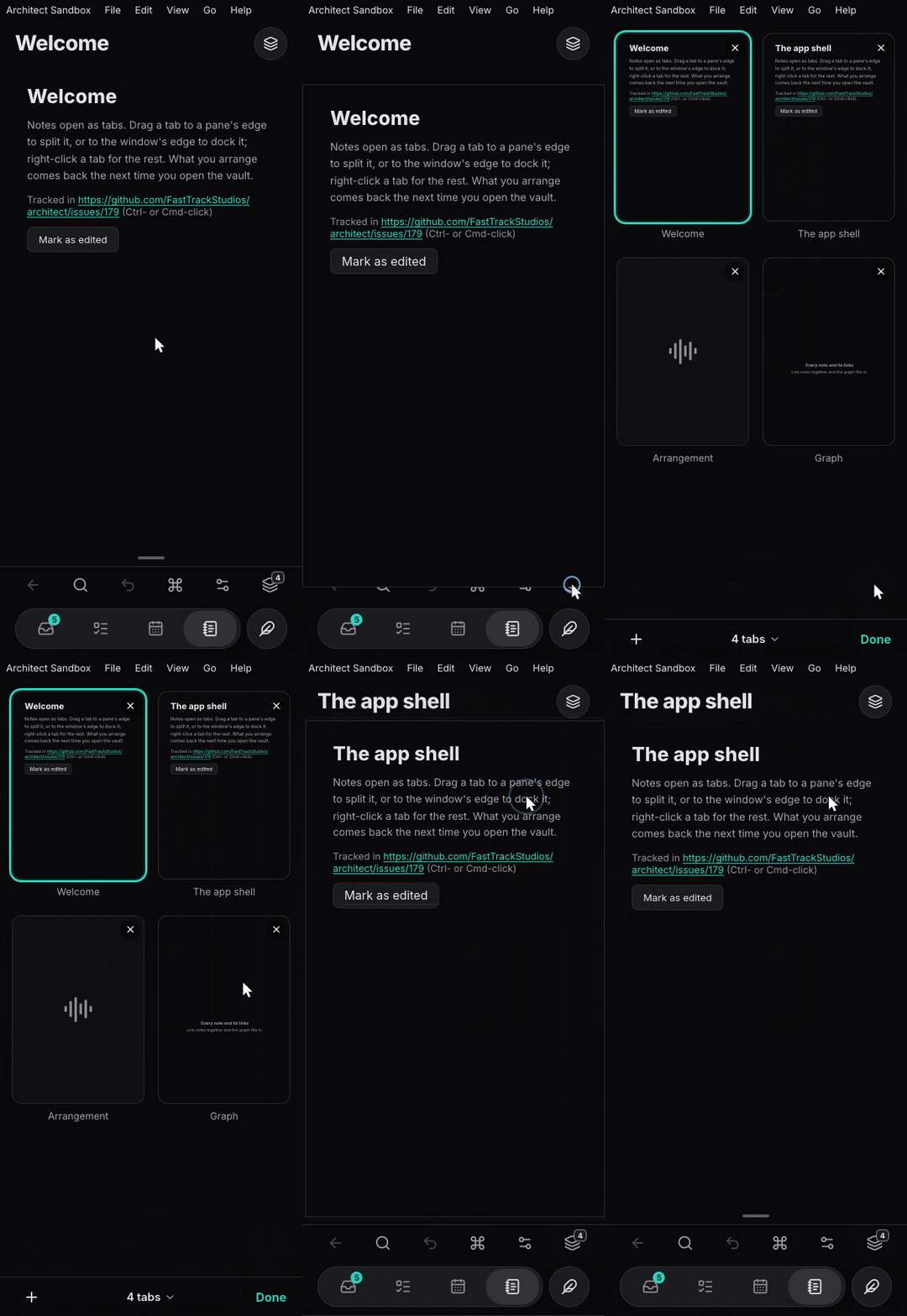
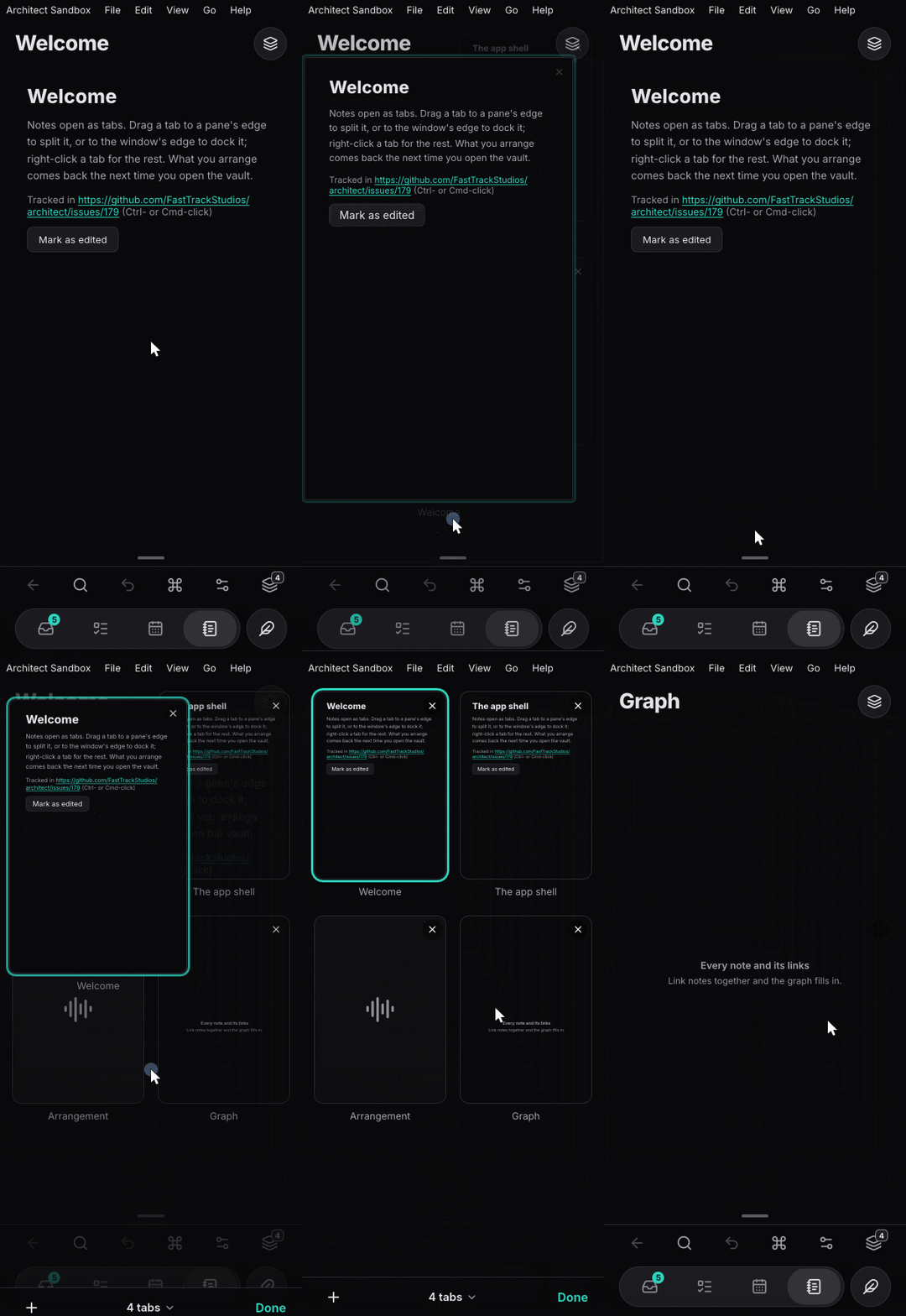
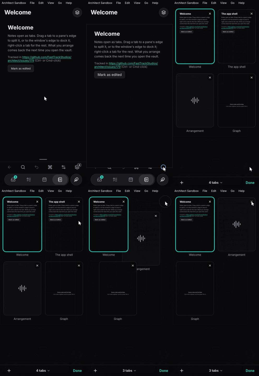
On a phone a workspace is one pane at a time, with Obsidian’s tab
switcher: the action bar’s tabs button (use_tabs_button, counting the
tabs), or a pull up from the grip along the pane’s foot, zooms the
pane out into its card in a grid of every tab (a pull follows the
finger, and settles open past halfway or flicked up, else springs back),
each
card a live preview of its pane (the view drawn again, scaled down) or
its view’s icon (View::still, for a view that registers itself as it
mounts). A card’s ✕ or a swipe across it closes the tab and the others
slide together; a card held still is lifted and dragged to another
place; a card pressed zooms back into it. Under the grid, + opens a
new tab, “N tabs ⌄” shows a dock’s or a pop-out’s tabs instead, recalls
a screenset, reopens or closes tabs (pinned ones stay), and Done goes
back. Which tabs, the grid’s geometry and where a dragged card lands are
plain data: features/workspace/src/switcher.rs (Place,
Workspace::cards, CardGrid, reorder_dest).
features/workspace/tests/workspace.rs covers every operation and the
repair after each.
The commands overlays#
architect-commands (features/commands, feature ui), mounted once with
use_commands_provider and CommandLayer (the
commands chapter):
let commands = architect_commands::use_commands_provider();
rsx! {
    AppShell { /* … */ }
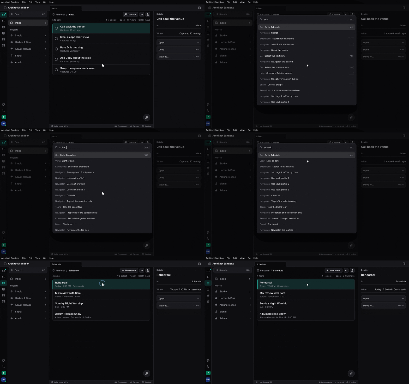
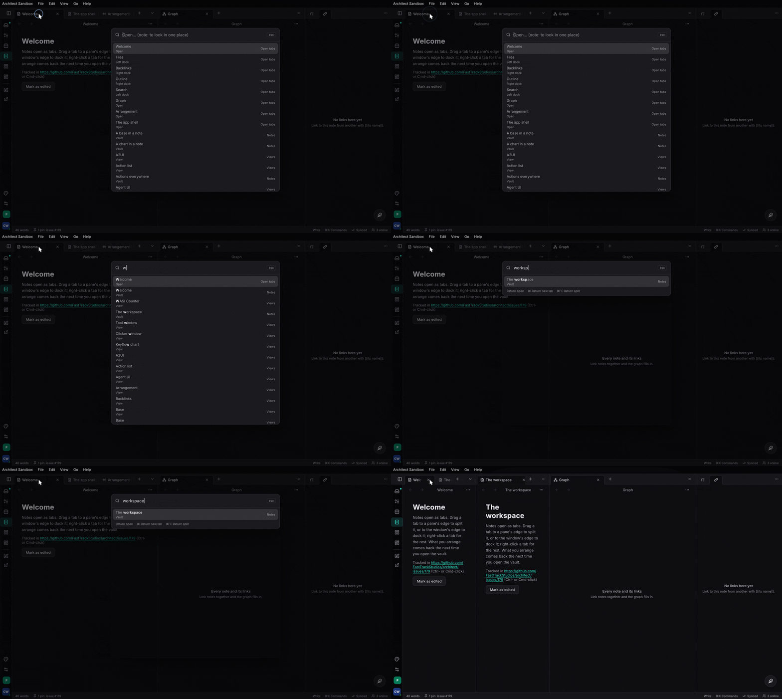
    architect_commands::CommandLayer {}            // ⌘K palette and ⌘O quick open
}
// open from code:
commands.show(architect_commands::Overlay::Palette);
commands.show(architect_commands::Overlay::QuickOpen);
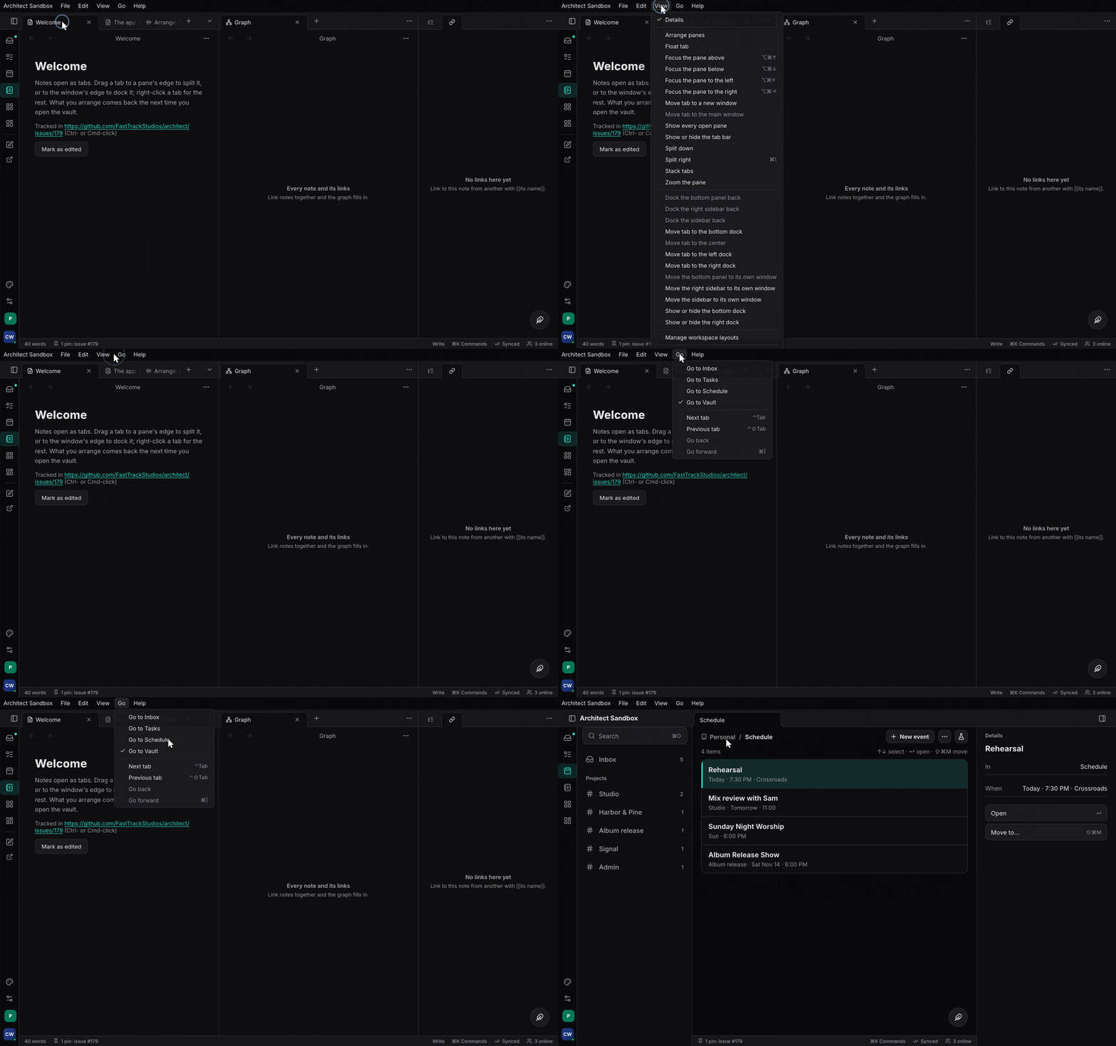
CommandLayer: the palette slot. The Command Palette extension (architect-command-palette,features/palette/extension) draws ⌘K (every command; arguments asked a step at a time;@,#,?prefixes) and ⌘O (every opener at once) in it; with no palette installed, nothing shows.ActionListView: the action list window with itsBindingEditorandKeymapTools; mount it as a workspace view (View::new("actions", "Action list", |_| rsx! { architect_commands::ActionListView {} })).WhichKeyPanel: what can follow a pending key sequence or a held tool.InWindowMenus/NativeMenus: the menu bar from aMenuBar.
The settings page#
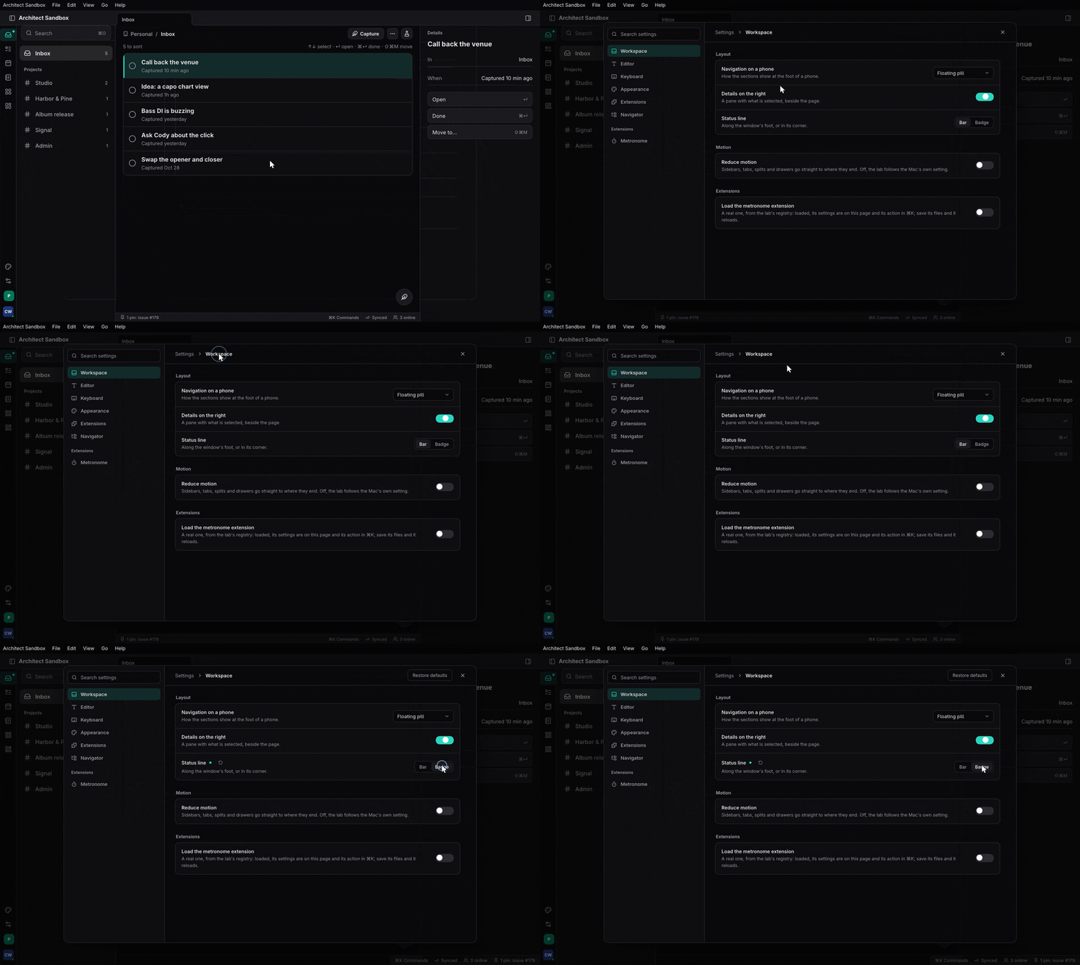
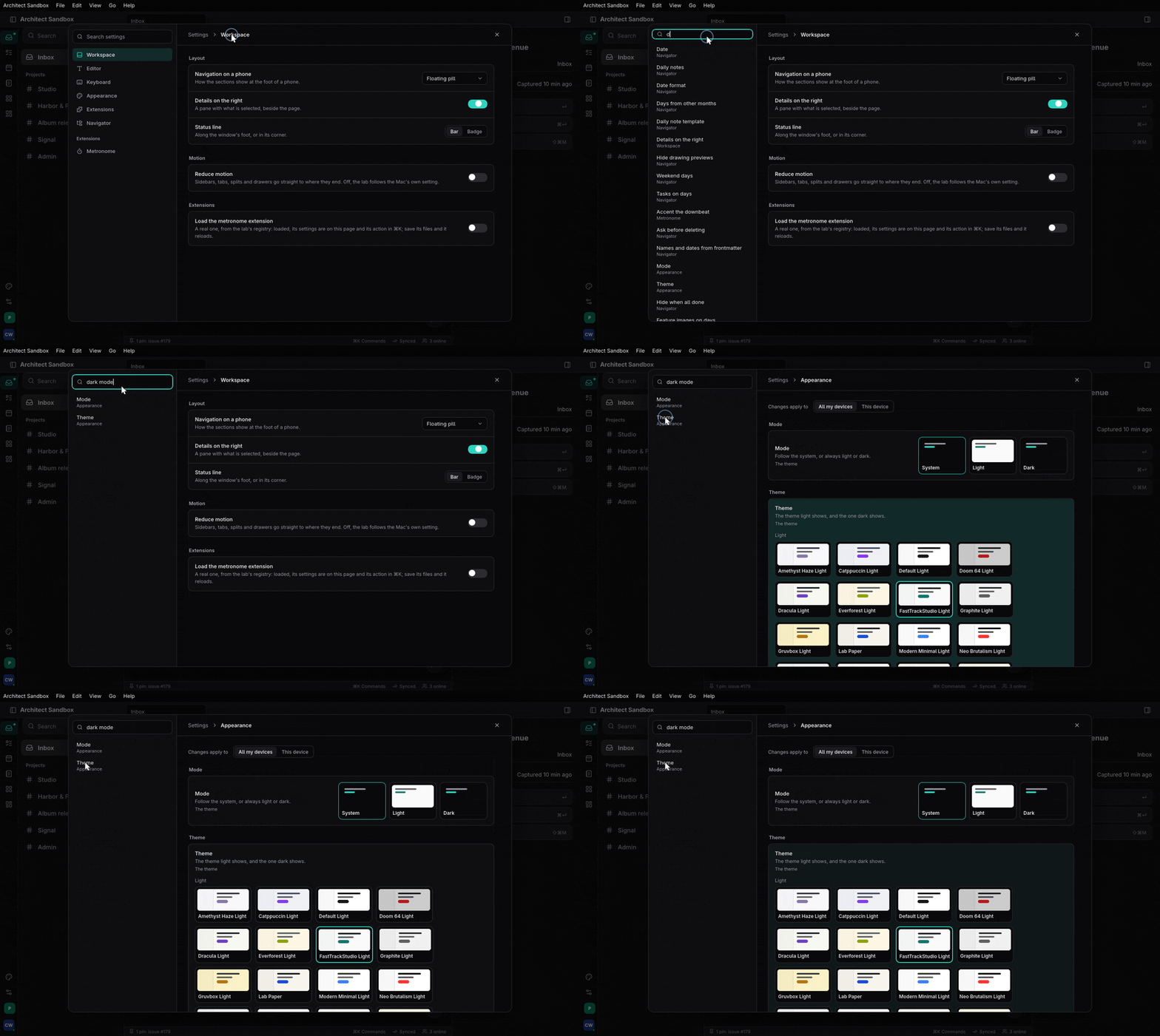
SettingsPage (architect-settings, feature ui), mounted once under
use_settings_provider (the settings chapter):
rsx! {
    AppShell { /* … */ }
    architect_commands::CommandLayer {}
    architect_settings::SettingsPage {}            // ⌘, and the palette's #
}
Every row is drawn from its Setting’s Control: a switch, a select, a
segmented control, a slider with its value in a chip, cards, a stepper, a
text field, a shortcut recorder.
Browsing them: architect-story#
architect-story (features/story) is a component browser and a visual
regression harness. A story is a function marked #[story]; its
arguments are knobs the browser lets you change:
use architect_story_runtime::story;

#[story(category = "Buttons", name = "primary", knobs(label = "Click me", disabled = false,))]
pub fn button_primary(label: &str, disabled: bool) -> Element {
    rsx! {
        div { class: "p-6 bg-background text-foreground",
            Button { variant: ButtonVariant::Primary, disabled, "{label}" }
        }
    }
}
(features/ui/architect-ui/src/stories.rs.) Every story lands in one
registry; Lookbook (features/story/architect-story-shell) is the
browser over it, and architect-story-snapshots renders each story
headless in Blitz and diffs it against a committed baseline.
What is honest to say about it today (features/story/README.md):
about 40 stories, all architect-ui’s own; no app mounts Lookbook; the
snapshot and parity harnesses work but nothing runs them as a gate. The
frame’s primitives (shell, workspace, commands, settings) have no stories
yet: browse those in the sandbox, and check them at phone, tablet and desk size
in features/ui/ui-snapshot (features/ui/ui-snapshot/src/scenes.rs, with
pixel probes in features/ui/ui-snapshot/tests/pixel_probes.rs).
Where to read more#
- The app shell and the workspace.
- Actions everywhere and app menus.
- Settings: declared once, a page for free.
skills/architect/references/architect-ui.mdandskills/architect/references/blitz-quirks.md.
Linked from
- Build an app with architectA chapter-by-chapter walk through building a real app on architect: the contract, the backend, the server, the clients, the tests and the release.
- The app shell and the workspaceMount architect-shell at the root, give it tabs, sides and a status line, then hand architect-workspace your views and get tab groups, splits, docks, floats, pop-out windows and screensets.